Tuesday, December 4, 2012

Stop Wastin' Stuff

November 27th, This week we looked at mass wastage events. Most people when they think of mass wastage think of trash, but for the sake of this lab we referred to it as landslides and slope failures. In the lab we looked at landscapes prone to mass wastage events and factors that trigger them. In part 1 of our lab we looked at the Appalachian Mountain range and found that there is a wide array of rock types and terrain all moving in several different directions leading to a less-stable bedrock (i.e. more susceptible to mass watage events). Below is an image of what we were looking at:
Part 2 of our lab analyzed rainfall and elevation by viewing cumulative Doppler Radar data. The Doppler Radar allows one to see motion of precipitation and find out when and where rain will fall. If that rain happens to fall on an area with a higher risk of mas wasting, organizations can help people prepare for it. The image below depicts a large storm that moved through Forest Falls, California in July 11, 1999. The general direction of the storm was moving from the northeast. This is related the potential mass wasting events simply because if there is a higher risk of mass wasting on the northeast side of Forest Falls, the likelihood will increase even more because of the increased amount of rain on that side of the area.
Part 3 of the lab analyzed the aftermath of the large storm that passed through Forest Falls, but more specifically, the mudflows that resulted because of it. If you look at the map below, you will see several parcels of land (color-coded) at a bottom of a valley, which is Forest Falls, CA.  As you can see,The danger level of the parcels on the eastside of the area are highly susceptible, because the danger of the level of the slopes in that area are higher than the rest of the slope. This is poor planning altogether simply because the parcels are far too close to the slopes. We also found that vegetation played a huge role in the mudflow event that came after simply because a large amount of vegetation adds to the weight against the landscape leading to a higher chance of mass wasting. According to the map, there is a large amount of vegetation around the same area of a higher slope danger level which means the parcels will more likely take more damage in the event of a mass wasting event.
The next image shows the amount of rainfall from the storm itself (the darker the color purple, the higher amount of rain). As you can see, the north and southeast sides of the map had the highest amounts of rainfall. This is very much related to the areas with high slopes because these are the areas that are more likely to encounter a mass wasting event.
Finally, we looked at how damage was actually done from the storm. What we found is that the greatest amount of flowage ran straight through the higher amount of parcel damage, however the existing stream does not meet up with the flowage until the end of the parcels. In addition to the lab, we were asked a series of "critical thinking" questions which I have posted below if you so choose to read them! Q: What other forms of data could you have used to make components of this lab into a more realistic model. Be sure to explain. A: Other forms of data that could be used would be an actual damage assessment to the parcels (i.e. how much it had cost to repair the damage). Q: You examined a post-event analysis to see what went wrong. In terms of using this method to prevent such a disaster, can the GIS help prevent these events in the future? Why or Why not? A: GIS can do a lot to help prepare for future events. It draws from many different sources is developing a complex paradigm, such as the Doppler Radar, slope danger levels, and ultimately damage from mass wasting events. Giving this knowledge (such as the knowledge of slope risk) to organizations will allow those organizations to prepare areas for future environmental hazards. Q: What is the role of government/zoning laws when it comes to building in areas at risk for mass wastage? Do you think there are places where people should just not build, or do you think people should build wherever they want? How does the free market and mitigation efforts such as insurance come into this question? A: I believe that there are certain areas that people should just not build things (like the bottom of a valley or the top of a mountain) and I do believe that the government should give a warning in regards where it is safe (or not safe) to build/develop. However, I also believe in a free market and that people should have the right to build where they wish with keeping certain things in mind; what I mean by this is the government should watch closely and prevent people from building in areas that will either put others at risk or severely damage the environment without any benefits. As for insurance, people should be responsible for their own actions and if their insurance rates go up because they choose to build in areas of higher risk, that is their own “fault,” for the lack of a better word.

Volcanoes.

November 6th. This week's lab was dedicated to learning about volcanoes utilizing the program ArcMap. We started by observing where the majority of volcanic activity occurs, which is the "Ring of Fire." The Ring of Fire is a series of volcanoes that encompasses the Pacific Ocean from New Zealand, along the coast of eastern Asia, up to Alaska, all the way down to the bottom of South America. A large amount of the world’s earthquakes occur along the Ring of Fire, as well. We also saw that many of the volcanoes tend to be clumped together along the tectonic plates. This also creates a pattern of open spaces where there tend to be little-to-no volcanoes. By using this program we were also able to overview what year volcanoes occurred, where they occurred, how powerful they were (their magnitude), and the name of the volcano. This is helpful because it allows experts to know when, where, how many, and how powerful volcanoes have occurred and are occurring in a certain region. This data can assist in learning when and where future volcanoes will erupt as well as provide a good picture as to when specific earthquakes will occur. Fun facts: the most active volcano since 79 AD is Mt. Etna in Italy, which has erupted a total of 143 times since then. Also, the top 5 countries with the most volcanic eruptions are: Indonesia, Japan, the U.S., Russia, and Italy (a map of this is shown below).


After analyzing the world, we took a closer look at something more specific: Mt. Rainier. We observed what are known as lahars, which are types of mudflow or flows of debris formed of rocky debris, water and pyroclastic material. One such disaster was an eruption that occurred at Mt. Pinatubo, Philippines in 1991. A few days after the eruption, a typhoon hit the shores and washed much of the volcanic debris downslope as lahars. In terms of the Seattle metropolitan area, we found that many of its rivers run directly into the city and were the lahars tend to flow in the event of a volcanic eruption. In addition to this, major highway cross the path of the lahars. The map below shows this quite well.

Monday, November 19, 2012

Hurricane Sandy

So, unless you have been living under a rock in the last few weeks you most likely have heard of Hurricane Sandy. Over the last week or so, Sandy has been speeding towards the U.S. coast and causing damage in the Caribbean. What has been in many news articles recently is how this storm is going to affect the up-and-coming presidential election between Romney and Obama. If the outcome of the election was hard enough to predict before the storm made landfall along the New Jersey coastline, it seems that it may have played quite the role in the outcome. First of all, let us consider several factors that are making Hurricane Sandy as bad as it is right now. First, the fact that Sandy avoided most of the southern coastline and moved up the eastern coast then suddenly cut it. Also, it collided with a cold front along the Appalachian Mountains which caused a significant amount of snowfall along the east coast and it's effects were reported to reach all the way into southern Canada. There is no debate that the storm was quite devastating to the east coast (estimates ranging around $60 billion and a loss of over 100 lives; http://www.theatlantic.com/infocus/2012/11/hurricane-sandy-the-aftermath/100397/). However, one could ask, how could it have been worse? It could have move inland at a much faster rate. There is no doubt that the coastline got the worst of the storm (winds up to 96 mph and 26 inches of snow; http://lancasteronline.com/article/local/770347_Hurricane-Sandy-was-nasty--but-it-could-have-been-worse-in-Lancaster-County.html), but the inland got off pretty easy. The outcome was terrible and any time there is any life lost is horrible, but we are truly blessed to have gotten off so easy, per se. We are lucky to live in a country with broad mass-communication where millions of people got the information in good time and had time to prepare or evacuate. We are also blessed to have organizations such as the Red Cross that has so many volunteers willing to help out those in need.

Tuesday, October 30, 2012

EARTHQUAKE!!!!

Once again, we got to play around with some pretty cool ArcGis stuff, this time related to earthquakes. Intially, we took a look at fault lines and found that there is a greater chance of earthquakes occurring along fault lines; this is useful for experts as it allows them to better prepare for earthquakes in the future. We then analyzed the amount of ground motion and the amount of shaking during and earthquake. The bottom line of these exercises were to provide us with the knowledge that the more that experts know, the better they can help agencies to prepare for future disasters. For instance, areas that are highly populated and are right along (or right near) a fault line most-definitely need more preparation for earthquakes. If more preparation is done, it not only can save more lives, but it also can save a lot of damage to things such as infrastructure. After analyzing that basic earthquake stuff, we then delved into a section called "earthquake loss and destruction" which focused on, well, what earthquakes do in terms of loss and destruction. First, we analyzed the damage to building caused by an earthquake in Northridge, CA. The maps below show the status of the buildings: the first shows the density of damage (i.e. how much damage was caused to the buildings) from the earthquake and the second shows the "status" of those buildings (i.e. whether use of those buildings were safe, limited, or unsafe).
Next, we took a look at liquefaction, which is where soil loses it's strength (mostly during an earthquake) and gives way, causing damage to infrastructure (e.g. buildings, roadways, etc.). Below is a map showing the liquefaction from the earthquake ranging from moderate to high to very high. It is interesting to note that the amount of liquefaction from the earthquake is closely related to the damage done to buildings.
Lastly, we looked at two other terms: peak ground acceleration (PGA) and peak ground velocity (PGV). We found that there is a higher level of accelerartion at the focal point of the building damage. The maps below show this (the first shows PGA; the second shows PGV).
All in all, the use of ArsMap in this lab gave us a deeper unstanding of how experts can prepare for environmental hazards. ArcGis allows for experts to fully understand the effects of an earthquake. It allows them to view the amount of acceleration as well as the velocity and compare the two to dictate not only where the majority of the damage was during the earthquake, but also it will help for future planning of future earthquakes. It allows them to pass that information along to building contractors and government agencies to better prepare populated areas in the event of an emergency. At the end of the lab we were asked what forms of data would prove to be useful in putting together a GIS analysis? I said that the amount of population density would prove to very helpful in order to predict things such as the amount of warning time an urban area would need; population density would also allow governments in deciding how much money to sanction to a given area in order to prepare for an emergency. Also, the amount of current preparations set up for an earthquake in urban area would prove useful in this regard, as well.

Thursday, October 18, 2012

Drought...it effects us more than we think.

In my geography lab, we covered some more very pertinent information once again. This time, we talked about drought (more specifically, drought in the United States). First, we talked about the Palmer Drought Severity Index (PDSI), which is a way of determining “dryness” of an area by measuring the temperature and amount of rainfall. We found that the worst areas of the U.S. affected by drought are the Midwest, as well as the southeast. We did all fo this with Google Earth. Next, utilizing the ArcMap program, we found once again the Midwest of the U.S. was most affected by drought (see map below). This is noteworthy because most of our agriculture is grown in the Midwest and a severe amount of drought will directly affect the amount of crop yield. We do not feel the effects of this too much simply because we are a rich country (or a "More Developed Country"/"MDC"). Because our average crop yields are almost always more than we need to survive, when we experience a drought, and because of the excess in crop yields, even if there is a shortage of crops we still have more than enough to feed the population. However, as we have started to see, this will most likely affect the prices of not only crops, but also foods from livestock. Because we need to feed livestock with our crops, if there is a shortage of crops it will not only affect how many crops are available for consumption, but it will affect how much food is available to feed our livestock; this, in turn, affects how much meat is available. The bottom line is: the less food there is, the higher the prices will be because it now costs more for farmers to raise their crops and livestock.
Next, we took a quick look at the "USA Soil Survey" (see map below) which shows where "good" and "bad" soil is located in the U.S. We found, believe it or not, that the majority of the good soil (green colored on the map) lies within the Midwest (the same area I spoke of earlier). On a side note, the green colored soil on the map is known as "Mollisols" which is a soil order that is the richest within the continental United States; it produces, or it should produce, the highest yield of crops and is found mostly in the Midwest.
We then looked at soil orders and found that areas that are normally supposed to be high-yielding in crops are actually not yielding nearly as much. Looking at the map below, the areas that are darker green show low crop yields; the darker green lies directly where the mollisols soil order is.
After looking at all of the information, one can develop an understanding of how crop yields are being affected. By looking at the types of soil that lie within the U.S., as well as the PDSI, we know that over the past 100 years, there has been a continual trend of an increased amount of drought. This increased drought, because of its location (i.e. the Midwest), will decrease the amount of crop yields, which will increase the prices of foods.

Tuesday, October 9, 2012

Messing around with more GIS


Last lab we got to mess around with some more GIS (Geographic Information System) software again; this time, however, we got to take a closer look into earthquakes (with the system called “arcgis”) and the type of data that is stored from around the world.  First, we took a look at areas in Southeast Asia (Figure 1) and how many earthquakes occurred in that area.  We took note of how dense populations were near areas containing a high frequency earthquakes; that is, many earthquakes occurred along the Earth’s plates and these plates happened to be right near many coastlines.  Because of this this there was a greater chance of a tsunami that could devastate populated areas.  Additionally, we took a look at the Mediterranean area and found that many earthquakes occurred along mountain ranges (also the location of many the Earth’s plates).  The bottom line of this exercise was to take note how governments and private organizations can help prepare to mitigate the damage of natural disasters.  With this data, these organizations can know where the majority of earthquakes occur and possibly save many lives and prevent excessive damage from occurring.

Figure 1.  Location and magnitude of earthquakes in Southeast Asia and Australia.

Figure 2.  Location and magnitude of earthquakes in the Mediterranean.

After this we analyzed the magnitudes of earthquakes across the globe (Figure 3).  We found that the regions with the strongest earthquakes are the southeast Pacific, Indonesia, and Central America.  We also found that the majority of earthquakes occur along the fault lines that I mentioned earlier.  However, these are several earthquakes (even those of a greater magnitude) that occur away from the fault lines, as well.  This is because, even though larger earthquakes are more likely to occur along fault lines, it does not mean no earthquakes (even large ones) will happen away from them.  With this in mind, organizations should still have emergency plans in place if natural disasters (even unexpected ones) occur.

Figure 3.  Magnitudes of earthquakes across the globe. The larger the blue dot, the greater the magnitude.  Red dots signify earthquake with a magnitude greater than 8.0.

One question we were asked in lab was “How does the information in this lab relate to hazard risk assessment?”  The information we covered in lab is critical in developing hazard risk assessments simply because developing these assessments involves a lot of research and one of many steps involves investigating where past hazards have occurred.  In terms of earthquakes, data from arcgis shows that the majority of earthquakes occur along the Earth’s plates.  The data also shows what areas of the Earth at a higher risk (i.e. LDCs are more likely to get hit and take more damage than MDCs).
Overall, this lab was very helpful in learning more of how the experts have adapted in the use of different technology.  It also helped in learning how they can aid in the mitigating the amount of damage caused by natural disasters.  I look forward to using this technology in class more and continuing to learn about it even more. 

Monday, September 24, 2012

The Cat Island Restoration Project: Yea or Nay?

The other day I was watching the evening news (at my mother's house in the Green Bay area) and a news story caught my attention.  First of all, over the past half a century a series of small islands (known as the "Cat Islands") in Green Bay (the body of water, not the city) has undergone a slow but steady process of erosion.  This is mostly due to rising water levels and severe storms within the bay.  Secondly, every year the city of Green Bay must go through dredging, which is the digging of soil at the bottom of a river in order to, in this case, make room for large cargo ships that make their way through the bay and the channel.  However, what is left over is a massive amount of soil that either settles into the bay or back into the channel.

The story covered a new project that is currently underway to essentially move all of that soil to the Cat Islands, not only to remove it from the channel, but to possibly re-establish several lost habitats for many species of birds, fish, turtles, amphibians, and invertebrates.  This idea is great in theory and it would be fantastic to put the soil to good use.  However, what is being ignored (and this was mentioned in the news story) is if the soil being used is actually clean, even though the project directors say it is.  This is troublesome, because it is not a completely far-fetched idea that the soil would be dirty; after all, several hundred (if not thousands) of ships (both cargo and non-cargo) make their way through the channel and bay, leaving behind exhaust, oil, and sewage.

The movement of the sediment is scheduled for Summer of 2013.

Here is a link to the presentation all about the project: http://www.portofgreenbay.com/uploadedFiles/Cat%20Island%20Presentation.pdf

Tuesday, September 18, 2012

Wildfires

Once again, in my geography course we tinkered around with some pretty cool software (much like we did the other day with "Stop Disasters"). This week, however, we took a look at some software that actually deals with the "real world" (not that Stop Disasters is not "real world," it just does not depict actual events happening in the real world). The program we were using this time around was called ArcMap which is Geographic Information System (GIS) that utilizes data collected from a plethora of agencies (both government and private). This data ranges anywhere from reported earthquakes to floods to wildfires; the latter is what perked my interest the most.

As I am sure you have heard, Colorado was recently hit by a series of wildfires from June to July this year. This burned over 200,000 acres of land, more than 600 homes, and resulted in millions of dollars in damage (Wikipedia: http://tinyurl.com/9k7kqqp). One of the causes of the fires was no doubt from extremely dry conditions (from drought the winter before) as well as high temperatures before the wildfires broke out. This history of wildfires interested me, so I decided to do a little research into them.

First, I looked up what wildfires were currently going on the U.S. as of now. I found that, unsurprisingly, the majority of wildfires (at least of now) are occurring in the Northwestern U.S.; no longer in Colorado, but in Utah, Wyoming, and especially Idaho (as seen by the map below).

Taking into account how the Colorado fires took place, I decided to also look into past reports of drought as well as rainfall in that area over the past few months. What I found was what I expected. Over the past few months (from June to forecasts going into October), it has been quite dry in many areas where wildfires are currently active (as seen by the maps below: June to August on the left and August to October on the right):

I am sure this is not really any shock to some well-versed meteorologist, but I just found it interested. I hope you did as well!

Friday, September 14, 2012

Stop Disasters...seriously, stop them.

So, in my Geography 361 class we were tasked with playing an online game called "Stop Disasters." It is a small game, funded by the ISDR (International Strategy for Disaster Reduction) in which the object is to "save lives" by building defenses, warning systems, better housing in a pre-set community where a natural disaster is about to hit. On a side note, the ISDR is a collaborative group of colleges, organizations, and institutions with the goal of "reducing the number of dead and injured by disasters triggered by natural hazards." They analyze steps that can be taken in order to reduce or remove the impact of a natural hazard; they use the Stop Disasters game to promote awareness of the impact of natural disasters, as well as educate people on what precautions can and should be taken to do so. Okay, back to the game. In my class we were to play the "tsunami" scenario where, as you may guess, we are to protect a little town along the coast of I-Shouldn't-Have-Built-My-Village-On-The-Coastville (which is somewhere in Southeast Asia).
As you can see above, one of my main strategies was to build most of the residential (the concrete houses and hotels) on the high ground. The high ground provided a natural barrier simply because it was above the highest point of the tsunami (15 meters); I did not know the initial height, but I assumed the high ground would be high enough (which it was!).
Secondly, as shown above, I focused on providing protection the main disaster shelters (the school, hospital, and community center) as well as building warning devices on in the community center to warn as many people in advance; you can build deep-sea seismic sensors which can serve as an early warning device (approximately 4 hours) for people, which can save many lives. Overall, I believe I did a pretty good job. Only 22 people died and 22 were injured; I wish the total casualties was a bit lower, however. I forgot to build up the defenses on a few of the small (brown) hotel-huts and log huts and I believe that led to those casualties. You can take a look at the "new post" the end of the game shows if you wish:
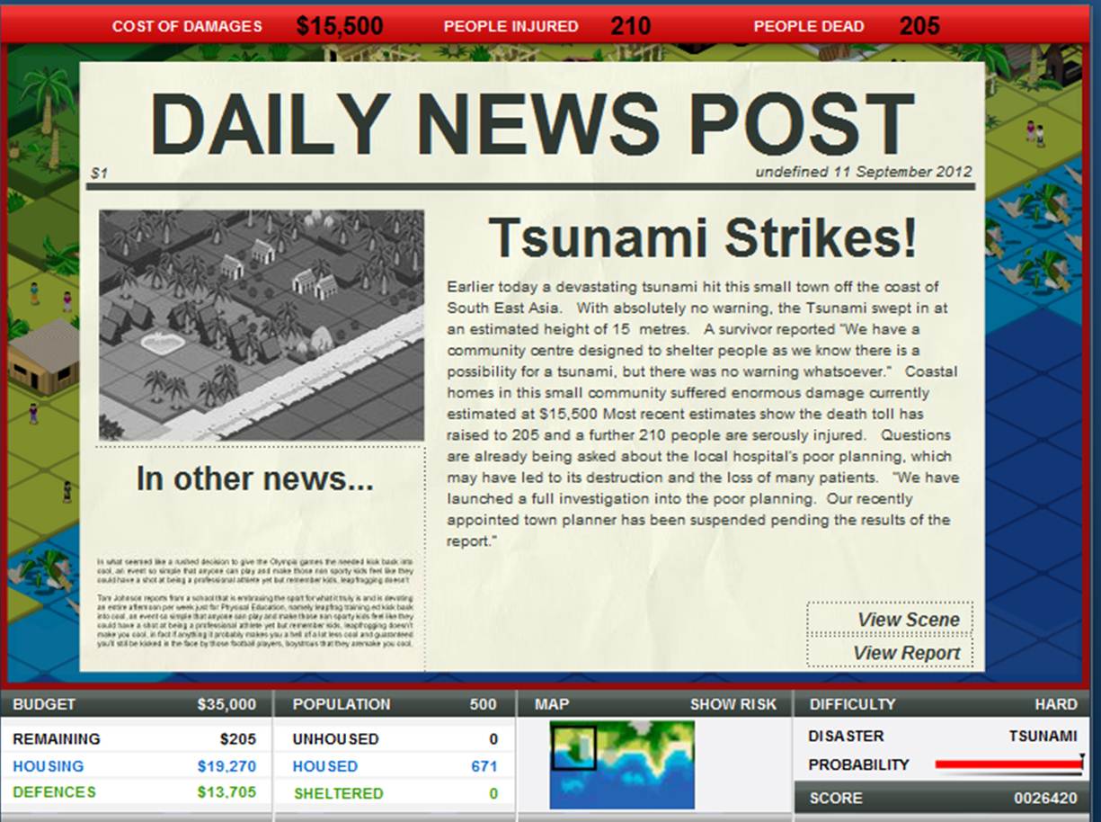
Next, however, was the fun part. We were "tasked" with doing a horrible job at protecting the town and see how much damage could be done. Challenge accepted. So, as instructed (and as you can see below) I did a great job at doing a horrible job. It is hard to read, but the end results showed a 15 meter tsunami decimating the small town of 671 people; 205 died and 210 were seriously injured with $15,000 in damages.
The news report even states: "We have launched a full investigation into the poor planning. Our recently appointed town planner has been suspended pending the results of the report." Mission accomplished.
In all seriousness, though, this is no laughing matter. In the game, one tourist asks, "Hey! Why don't you build the hotels on the shoreline? That would be sweet!" The sad fact is that this situation is very common for most tsunamis is actually what happens in most tsunamis. The people (tourists) want to have the best view of the ocean and hotels are right along the water, which is all well and good. That is, until a tsunami (like the one in 2011) hits and devastates an entire city. In my little game, only 205 people died and 210 were injured. However, in 2011 15,867 people died, 6,109 were injured, and 2,909 were missing, which is a far more serious issue than a video game.
The main point of this game, I believe, is to educate and inform people on what can and should be done to help prevent disasters. In my opinion many villages should not be where they are (preparations should not be made to protect a certain area if that area is constantly in danger of a natural hazard. This includes places like I-Shouldn't-Have-Built-My-Village-On-The-Coastville and real-world places like New Orleans. Both of these places are in a hot spot to experience devastation and it costs billions of dollars to keep them afloat...pun intended.